Poster Design | Typography | Social Impact Campaign
Project Overview
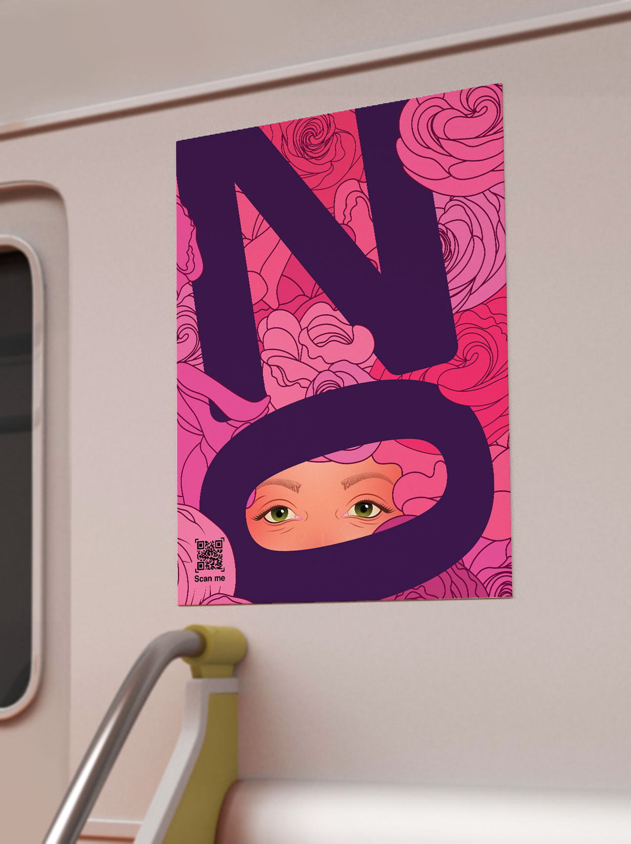
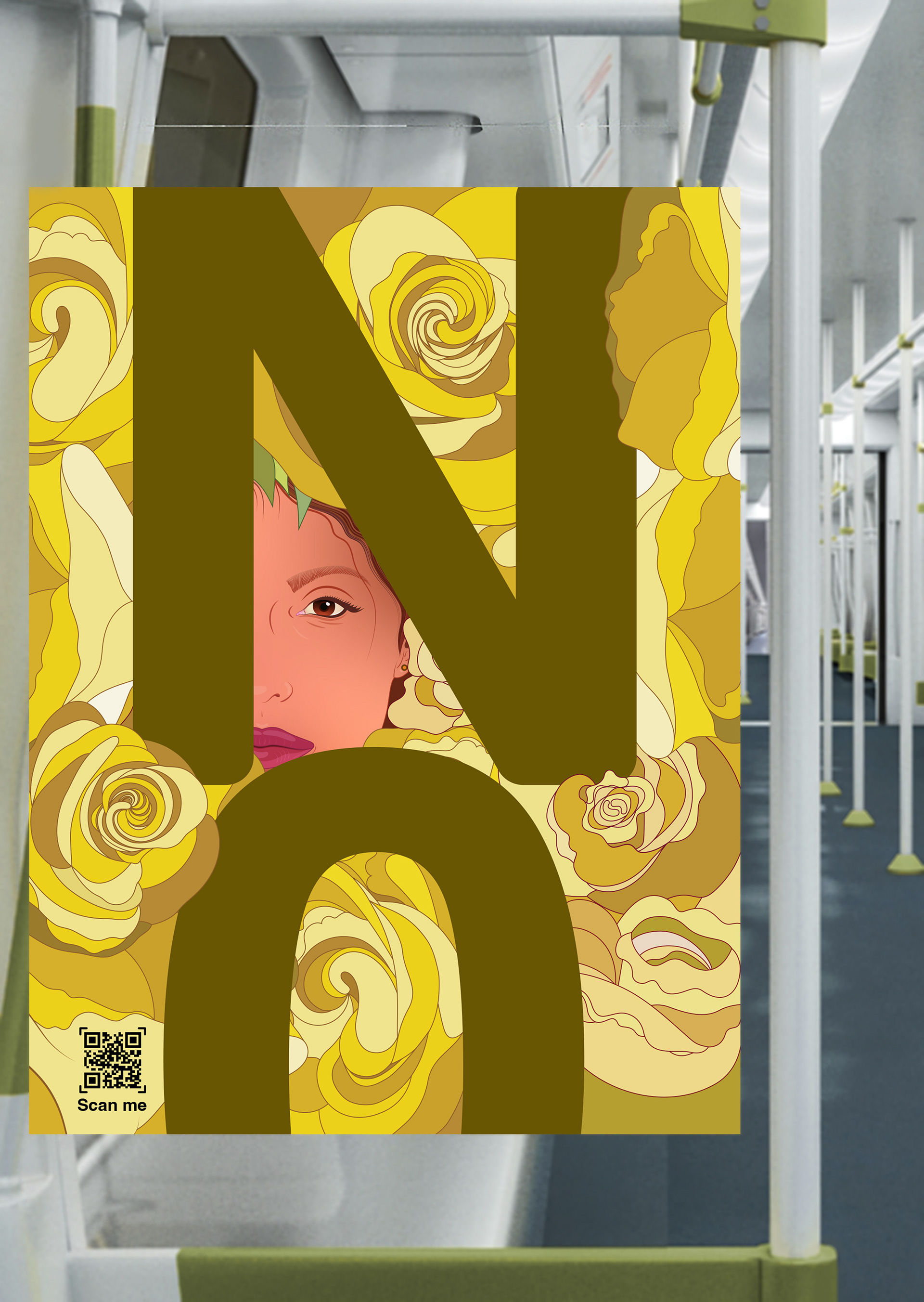
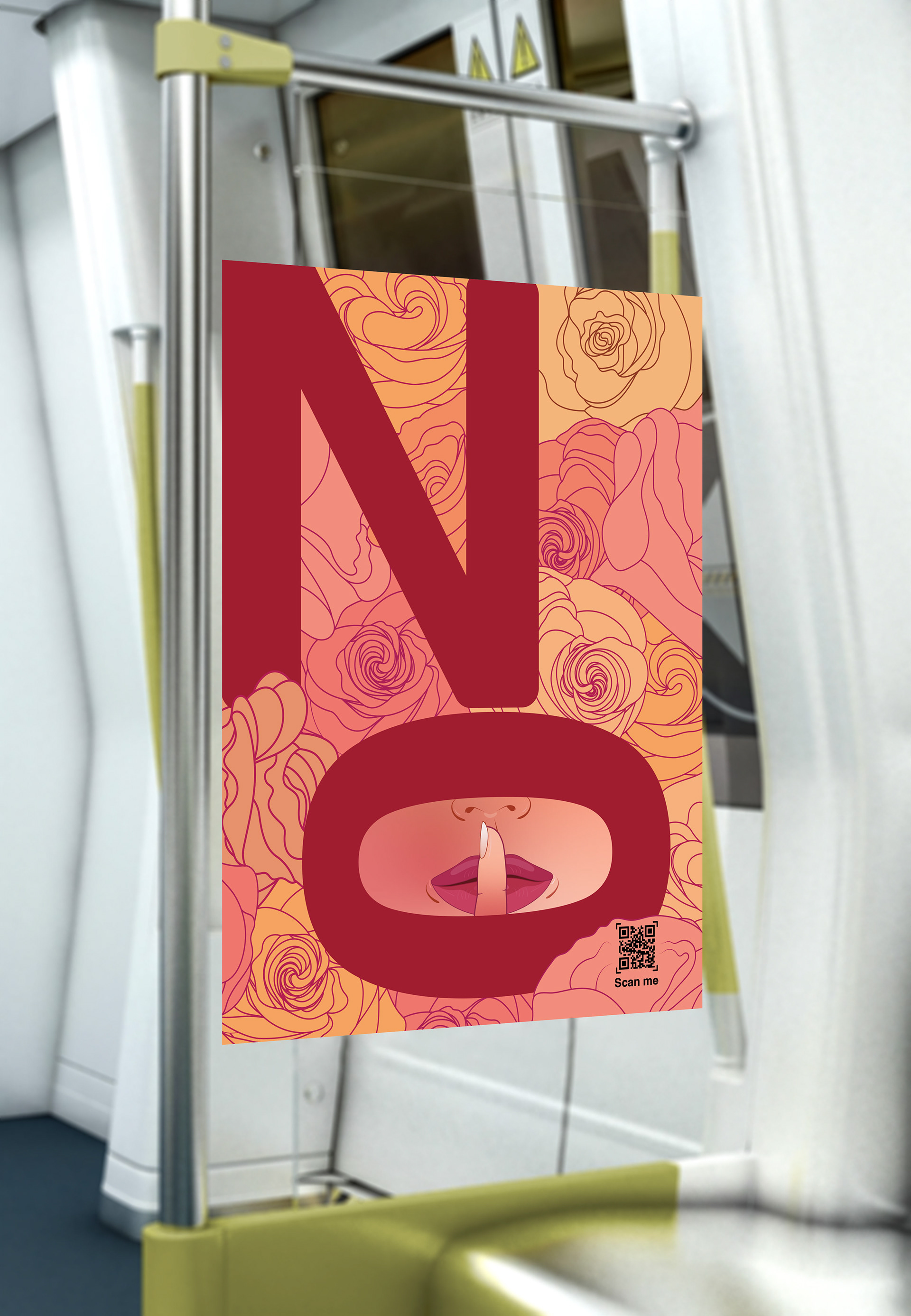
“NO” is a typographic poster campaign created to raise awareness on the International Day for the Elimination of Violence Against Women. The design plays with the boldness of the word “NO,” subtly integrating hidden figures of women within the letterforms to represent the silence, fear, and invisibility many women face when experiencing abuse.
“NO” is a typographic poster campaign created to raise awareness on the International Day for the Elimination of Violence Against Women. The design plays with the boldness of the word “NO,” subtly integrating hidden figures of women within the letterforms to represent the silence, fear, and invisibility many women face when experiencing abuse.
Design Objective
The goal was to deliver a powerful, minimalist message that could stop a passerby—especially in transit environments—and discreetly offer access to help. The poster is designed to function both as an emotional statement and a practical resource.
The goal was to deliver a powerful, minimalist message that could stop a passerby—especially in transit environments—and discreetly offer access to help. The poster is designed to function both as an emotional statement and a practical resource.
Key Features
Typographic Concept
The word “NO” becomes both a declaration and a visual metaphor. Hidden silhouettes of women are embedded within the negative space, symbolizing voices suppressed or overlooked.
The word “NO” becomes both a declaration and a visual metaphor. Hidden silhouettes of women are embedded within the negative space, symbolizing voices suppressed or overlooked.
QR Code for Silent Assistance
A scannable QR code is integrated into the poster with a subtle “Scan Me” prompt. It directs users to a mobile-friendly site where women or their friends can discreetly access emergency contacts, live chats, or information—without needing to speak on the phone.
A scannable QR code is integrated into the poster with a subtle “Scan Me” prompt. It directs users to a mobile-friendly site where women or their friends can discreetly access emergency contacts, live chats, or information—without needing to speak on the phone.
Minimalist Aesthetic
The design uses only essential elements—typography and layout—keeping the message clear and immediate. The simplicity ensures quick readability in busy public spaces like subways and train stations.
The design uses only essential elements—typography and layout—keeping the message clear and immediate. The simplicity ensures quick readability in busy public spaces like subways and train stations.
Feminine, Purposeful Color Palette
A soft yet strong combination of deep violet and rose tones conveys urgency, femininity, and empathy without overwhelming the viewer.
A soft yet strong combination of deep violet and rose tones conveys urgency, femininity, and empathy without overwhelming the viewer.
Placement & Audience Engagement
Designed specifically for subway platforms and transit stations, the posters are positioned to catch attention in high-traffic areas. The clean layout and discreet call to action allow individuals to engage with the message safely and privately.
Designed specifically for subway platforms and transit stations, the posters are positioned to catch attention in high-traffic areas. The clean layout and discreet call to action allow individuals to engage with the message safely and privately.
Outcome
“NO” transforms minimalist design into a meaningful form of silent advocacy. By combining typography, symbolism, and accessibility, the campaign offers both awareness and action—encouraging women to seek support in a way that feels safe, powerful, and unseen by those who may be watching.
“NO” transforms minimalist design into a meaningful form of silent advocacy. By combining typography, symbolism, and accessibility, the campaign offers both awareness and action—encouraging women to seek support in a way that feels safe, powerful, and unseen by those who may be watching.